On occasion, I help some of my author friends with their websites. Having had an author website for a number of years, it is clear to me what my site(s) need to do and how they represent me and my brand on the web. When social media ramped up several years ago, I noticed a lot of authors abandoning their sites, or choosing to microblog instead of having a full blog, and while I believe everyone should make the decisions that are right for them … and trust me in the writing world there is NO one-size-fits-all, I decided to hang on to my URLs and continue as I was before. Yes, I added social media elements to my site, but have always been of the opinion that my site is my home on the web. If someone is looking for information about me or my work, I want it to be available in one place rather than sending them all over the internet. Anyway, during a discussion with an agency-mate about some upcoming changes to her website, we got on the topic of logos.
I’ll be honest, coming up with an image that encapsulates me and my work was a task I found daunting. Over the years I had tried a few different types of logos, but nothing that really stuck. Most of them revolved around a lighthouse theme, but for no other reason than I like lighthouses. Which is frankly not enough of a reason to make something your logo. There should be some sort of significance. Then, when getting ready to attend a conference, my agent, Italia Gandolfo, told me I needed up my web game and to get a logo. So my entire site got a revamp and I commissioned a logo. The problem is that I still had no idea what I wanted, so she said she’d take care of it, that I should focus on the rest of the site.
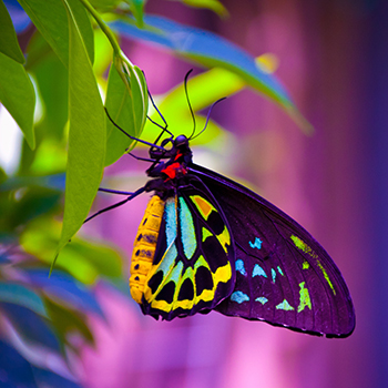
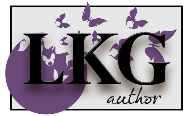 I was in very good hands. Italia knew better than I did what type of logo I needed and once I saw it, I loved it and the symbolism. Because I write for a broad spectrum under the banner of Children’s or Juvenile Fiction, I had trouble conceptualizing how to encompass that same spectrum. What is more perfect than the symbol of a butterfly? Butterflies are powerful symbols of life — they represent significant transformation. On the young end of my writing spectrum, I write for seven to eight-year-olds, but I also write for preteens, and on up through Young Adult. So my target audience encompasses the gamut of the butterfly life cycle.
Children are like the caterpillar exploring the world with fresh eyes and a hunger for new experiences that just won’t quit. Preteens and young teens become introspective and go through a phase of change as they try to figure out who they are and what they want to be, much like when the caterpillar constructs the cocoon. Older teens burst through that shell, dry their wings, and take flight going off to explore the world in a way they couldn’t before.
Besides, butterflies are pretty. But I honestly cannot think of a better image than the butterfly to be the icon for my work. I ran across a video from the Dodo about the life cycle of the Lunar Moth. If you have a few minutes, it is well worth the watch.
4 Comments on “Behold the Butterfly”
Love this!
Thanks!!!
This is spot on. And it really is the perfect logo for you. Well done to you and to Italia!
Thank you. And yes, Italia has got my back in all things.